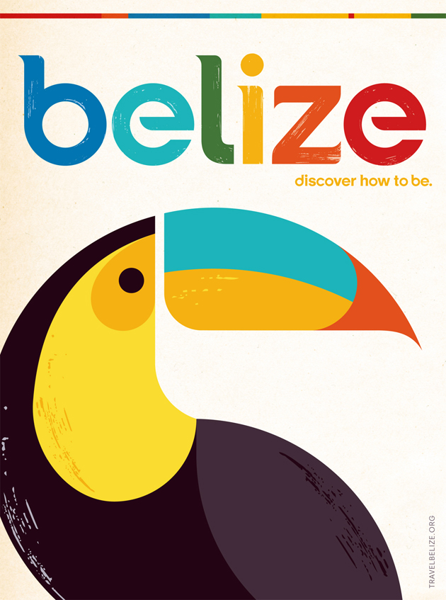
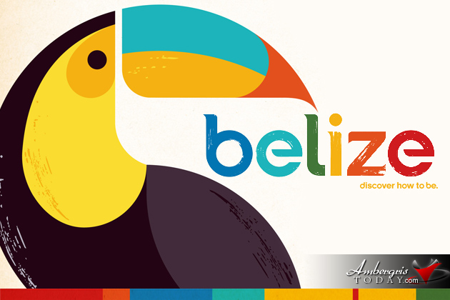
During the 12th Annual Industry Presentation of the Belize Tourism Board, Belize’s new brand and identity was announced as part of the BTB’s three-year Action Plan. With Belize’s logo and old brand being 26 years old, the BTB hired the Olson agency to refresh its marquee and they crafted this gorgeous, modern take on the Belize identity.
Olson says it turned to Belize itself for inspiration – the circular forms found across the nation inspired the new typeface, while a local artist contributed his own take to the national bird, the toucan. The identity brings a contemporary, yet classic vibe to represent tourism in Belize and utilizes the classic travel posters of the ’60s. The graphic forms are balanced out with textural brushstrokes – a nod to the handcraftsmanship of the country’s artisans.
Concerns were raised in reference to Belize not being capitalized in the new logo, but according to BTB’s Director of Marketing and Industry Relations, Alyssa Carnegie there is a perfectly logical explanation! The old logo was all caps which was too formal, she explained.
“Belize wants to be interpreted as the calm humble approachable and relaxed country it is. The new logo does just that! The lower case fonts show that Belize is inviting humble and friendly and not standoff!
According to Olson Chief Creative Officer Dennis Ryan on the Advertising Age website, “We wanted it to feel non-commercialized. A lot of times, tourist destinations try to create images that cater to the traveler, versus what the destination wants the traveler to experience.”
The logo is intended to feel modern yet timeless yet contemporary. Below is a behind the scenes video that shows the agency’s thinking behind the new Belize identity:
